Is Colour Really Important to Your Business?By Kelly Molson and Paul Wright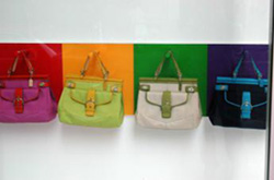
The colours you choose to represent your business can say a lot, so are you sure the ones you’ve used in your designs are saying the right things? Certain colours are naturally associated with particular industries. Green for “green” companies or environmentally friendly associations, Blue is used for water companies or legal/financial businesses, and I guarantee Purple makes you think of chocolate! But what about the rest of them……… Red say’s powerful, passion, love, heat & strength. Virgin, Vodafone and Coca Cola all rely on Red to stand out. It’s easy to remember these companies as soon as you see red. Yellow is bright & optimistic and can suggest sunshine & warmth. The golden arches of McDonalds are recognised the world over as a welcoming place, but be careful, it can also represent cowardice! Blue, the colour of safety, truth & dignity. Many financial associations such as Barclays us the positive hues of blue to communicate a safe and secure place to place your money! Green is the colour growth & nature, and has been used by environmental agencies & charities alike. Oxfam, BP and Holland & Barrett all use the positive colour in their branding. Purple conveys wealth, intelligence & sophistication, which is why Cadbury chose it for it’s velvety yummy chocolate! It does have some spiritual associations too, the Catholic faith relate it to mourning. Brown can mean trust, but is also seen as old fashioned and frumpy in some people’s eyes. Fashion & Interior trends have seen Chocolate Brown becoming increasingly popular. It’s especially used in coffee bars to simulate a relaxed atmosphere. Orange is warm and autumnal, think pumpkins and walks in the forest. It’s reliable and safe, so it’s not surprising that Sainsburys, EasyJet and of course Orange have all used it to excellent effect. Black is for strength, but also globally associated with death and mourning. Organisations can use it to indicate seriousness. White is traditionally used with other colours such as black. It can portray purity, cleanliness & lightness, but avoid it in Japan & China as Eastern cultures believe it conveys death. That might all seem a lot to digest but it goes to show colour isn’t just about personal preference. Your choices will ultimately be influenced by your companies’ aims, goals & the image you want to portray. A few things to remember… 1. Use Company colours to tie all your marketing material together. 2. Use colour for impact and emphasis but not too much at once. 3. Use tints and shades for variety and stick to colours from within one colour scheme as much as possible. 4. BE CONSISTENT! This is extremely important when using colour. If all your titles in a page are green, then that should be repeated throughout the whole document. Stick to the exact colour chosen by your designer too. If your logo is blue, find out the CMYK value and use the same blue all the time. 5. Have fun with colour! Take the meanings of colour into consideration, but remember it’s good to stand out from the crowd too. I mean, there’s nothing cowardly about Rubber Cheese is there! |